
Creation of CI-compliant charts and easy to understand diagrams
Numbers, dates and facts – the “classics” of infographics. We have all seen an infinite number of bar and pie charts, however not only must these be appealing to the eye, but also, and more importantly, need to display data charted specifically to not only the topic, but also to the target group.
Illustration of a diagramm with icons body weight and basal metabolic rate of animals
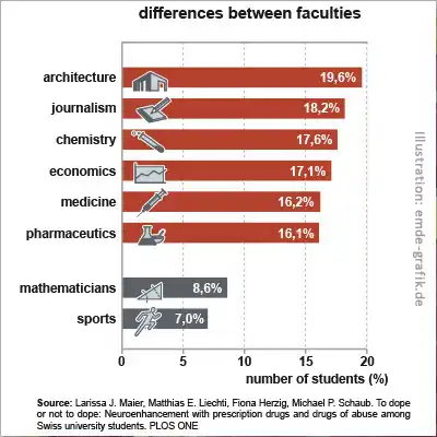
Graphic for study “Neuro-enhancement with students”
University Zürich (Switzerland)
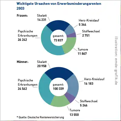
Doughnut chart:
“Most important reasons of reduction in retirement earning 2003” for “Deutsche Rentenversicherung” booklet
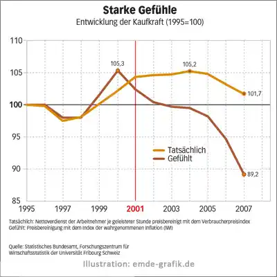
Line chart:
“Strong emotions”
Special edition “Wirtschaftswoche” (Popular German finance magazine)

Line chart + Key visual:
Targeted effect of pain killers
(in cooperation with Annette Gack)
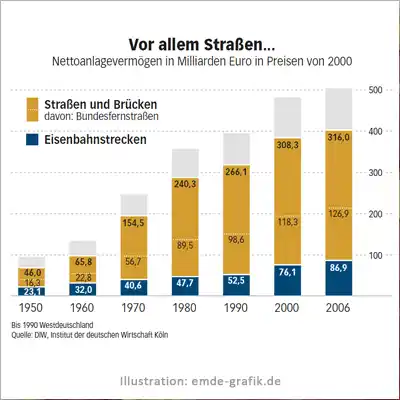
Additive chart:
Traffic investment
Special edition “Wirtschaftswoche” (German finance magazine)
Frequently asked questions about charts and diagrams (FAQ)
What is a diagram?
Charts and diagrams are widely used to display figures and are easily understandable due to their simplicity. Different types of charts include the bar or column chart, the pie or ring chart, the line chart and progression charts.
What do I need a chart for?
Primarily for figures and statistics.
To what do I need to pay attention?
In addition to the target group and corporate design, it is important to decide on the right form of presentation. For example, a pie chart or ring chart is best suited for presenting proportions of a whole, whereas a bar chart would represent the same data with an unfavorable visual language. You can usually recognize what is suitable from certain key words: For “How high is something”, use a column chart, and for “how wide is something”, a bar chart. “What is the chronological flow” calls for either a line or a flow chart.
Then: Less is more – whenever possible, charts should avoid too much decoration and complexity. Charts live from the fact that the information can be recognized quickly.
What is the procedure?
Once the corporate design has been clarified, the data sets are analyzed. The appropriate display formats are then selected based on this. The available space is also taken into consideration, which is often very important.
Who are charts and diagrams for?
Charts and diagrams are particularly widespread in the media, whether print, web, or television. They are also very helpful as a supplement or component of complex information graphics.